Smashwords vs. Draft2Digital

Some decisions are more difficult than others

Some decisions are more difficult than others

Smashwords vs. Draft2Digital is a dilemma facing authors who have already published their works with Amazon, both as an eBook with Kindle, and as a paperback with CreateSpace.

Both Smashwords (SW) and Draft2Digital (D2D) are book publishing and distribution platforms that supply major markets not covered by Amazon, namely, Barnes & Noble, Apple, and Kobo.

Smashwords is the larger of the two, offering a wider range of distribution options. It publishes in EPUB, Mobi, PDF, LRF, and PDB, as well as other lesser known formats. This makes your book available on B&N Nook, Sony Reader, Apple iBoostore/iTunes, Kobo, Scribd, and others.

Draft2Digital is the new kid on the block with somewhat more limited distribution options – at least for now. D2D does cover the major markets (B&N, Apple, Kobo), and it has one MAJOR advantage over SW. It will accept manuscripts in any Word format (doc or doc.x, RTF, or even EPUP), and convert them into eBooks in a matter of minutes.

Smashwords, on the other hand, requires extensive manuscript reformatting to make it compatible with its “Meatgrinder” – their term for the program they use to convert manuscripts into eBooks.

Smashwords touts that because of all the different formats it utilizes, it creates eBooks for all handheld devices, iPhones, iPads, Androids, etc – and all screen sizes. That sold me, and I chose Smashwords over Draft2Digital.

Having already used the “nuclear option” (see a previous post) to prepare my manuscript, I shrugged off the Meatgrinder requirements as well within my capabilities, and I was anxious to learn new formatting techniques.

Big mistake – not the learning part, but underestimating the requirements part.

Smashwords requires that Word.doc files must be prepared by following the instructions EXACTLY as per their Smashwords Style Guide, a 100+ page manual. The manual warns up front that the process is involved, but states that there are lots of pictures and all it takes is patience. Yeah, patience and a jar of antacids!

If you recall, the nuclear option requires converting your Word doc.x file into a Word doc file by saving it to Notepad. This removes all formatting, including italics, bold, and underlining.

AN ASIDE HERE:  If I had to do this part over, I would first make a spare copy (or 2 or 3), and then color code each style differently – red for bold, green for italics, blue for underlining (for example.) When it came time to reformat, this would eliminate searching the original document for each style because they would now be more visible.

Without going into too much detail as to what is required by the SW Style Guide, here are the major steps necessary in converting a manuscript:

  • All nuclear option fixes (tabs, indents, paragraph styles, punctuation, etc) must be done with SW as well.
  • Centering, bolding, the use of italics, font size and style, and line spacing are all accomplished by using the “Styles” pane – only – not by using the usual Word commands. Each section that is formatted differently will require a different style. Create these styles by using the Styles pane. Open the drop-down menu from which you can modify as many new styles as needed.
  • There are special tips for poetry, cookbooks, footnotes, endnotes, etc.
  • “NEVER, NEVER use tabs or space bars for anything!” Quote – unquote.
  • Do not justify the text.
  • The SW guide is so insistent on following their instructions exactly that I changed my line spacing from 1.15 to 1.5.
  • There are pages in the manual with instructions on hyperlinks and images for those interested.

And then there are the instructions for NCX and the table of contents (TOC). This was the one part of the instruction that I enjoyed. It taught me how to construct a navigable TOC.

NCX stands for Navigation Control file for XML  and is used for navigation within an eBook by creating a hyperlinked TOC. The basic steps, in order, are:

  • Type the TOC.
  • Bookmark each chapter heading.
  • Hyperlink each chapter heading to the TOC.
  • Bookmark the TOC title itself
  • Hyperlink each actual chapter heading back to the TOC.
  • Test your work.

Do not use the automatic Word TOC generator, as this will introduce errors. It is not compatible with the Meatgrinder.

The SW Style Guide also has specific instructions for the Title Page, Copyright Page, and for any blurbs that are to be included. Follow their instructions or you will introduce errors unacceptable to SW.

Needless to say, there are involved instructions for book covers as well.

The worst is over. Yea! Breathe a sigh of relief.

The manuscript is now ready to be uploaded. This is the easy part. On the SW Publish Page, click on the “Publish” tab and simply follow the instructions.

* If the manuscript has images, remember to uncheck the “Plain Text” box.

An email will be generated, and a notification will be posted on your SW dashboard that the manuscript is being checked for errors by the SW Autovetting Program.

Smashwords also recommends checking your work for EPUB compliance by downloading the free Adobe Digital Editions reader software.

Wait, with fingers crossed, for the results, which should be available within 24 hours.

I am waiting.FotoFlexer_Photo Quill

Once the editing is complete, let it be.


Have you been their?

Have you been their?

Once the editing is complete, let it be. – if you can. Mistakes are like gremlins. They love to show up just to wreak havoc regardless of all attempts to keep them out.

♪Mistakes? ♪I’ve made a few, and then again a few need to be mentioned♪

After receiving my paperback proof, I found several proofreading mistakes that I had overlooked while reading my manuscript off the computer screen. As mentioned in the previous blog post, we read our works so many times we get word blinded, and are no longer able to see even obvious errors.

So, it was with wide-eyed shock that while reading my book galley I found a paragraph that I had actually repeated twice. Correcting it was an easy fix, along with the insertion of two missing words that “suddenly” showed up.

This ease of repair emboldened me to go ahead and change a clumsy sentence here and there, sentences I had recognized as not quite right, but which I had chosen to ignore because of the press of the entire project. Now was my chance to fix those pesky little errors. So I did.

This is where we ended the last blog – I was awaiting my second proof, just in case I had made another foolish mistake. I was confident that my fix was impeccable, but not confident enough for me to just publish as it was without another read through. I know myself. I sometimes overlook the obvious. I had been ultra careful, so a mistake was unlikely. Still…

My caution was not misplaced. I had made a major mistake in my rewrite. By eliminating that repeated paragraph, I had changed the length of the chapter by a page. No big deal right? Oh yes it is! It changed the table of contents (TOC). The mistake was early in the work, chapter 4, so the pagination of every chapter after that was wrong. I simply forgot to update the TOC – a simple two key stroke updating procedure.

I had been diligent in checking the endings of each chapter for orphans and widows, but not diligent enough in checking the overall structure of the book, in particular the TOC. This meant another manuscript submission to Createspace. Live and learn.

A language junkie’s confession here.

While correcting those clumsy sentences, I simply could not help myself. I wound up adding a word, even a sentence here and there. Next thing I knew, I started tinkering with this and that passage until the sudden recognition of my addiction smacked me in the forehead and forced me to go cold turkey. I double-checked the few changes I had made and then double-checked them again, and then I SAVED my work and sent the damn thing off as it was. If I didn’t I would have been “fixing” this work until I died and never have written anything new.

So take it from a veteran in the combat of never knowing when to leave good enough alone. Eventually we must.

Of course, I had to order another proof just to be on the safe side.

Oh yeah, and as I was looking over a previous edition of my work I noticed a paragraph that would have been better placed had it been moved onto the following page. So I…

No, no I didn’t I let it go and walked away – but I did look back over my shoulder once.

BTW, out of the corner of my eye I also picked up a lack of quotation marks on one of those clumsy sentences I had “repaired.” So much for tinkering. Once the editing process is complete, let it be!

There was even a mistake in this blog I just found. Will it never end?FotoFlexer_Photo Quill

My book galley is here! My book galley is here!

The Riddle of Riddles front cover

The Riddle of Riddles book galley cover

My book galley is here! My book galley is here!

I cannot tell you how exciting it was to receive the hard brown cardboard box containing my paperback book galley. I was expecting it, of course, but it came two days late, and I was chomping at the bit waiting for it to arrive.

The packaging was great. A simple pull-tab released the proof into my waiting hands, and there it was.

There is was? No! Here it is! My first book, only a proof, a galley, but a book I could hold in my hands nonetheless.

It felt wonderful. I was filled with a sense of pride. The hard-won reality of what I had finally accomplished lay in my hands.

The cover is spectacular. The picture, the colors, the typography all add to the attractiveness of the book itself. However, the most sensual reward was the heft of the book in my hand. I flipped through the pages, raising and lowering the book in my hand, feeling its weight. Here it is! And it’s real.

I did get a rush when I published my eBook, and saw it listed on Amazon, but that feeling was minimal compared to how I felt holding a thing of substance – the book – in my hand.

An aside here about the cover. Because I do not draw, I hired a professional to do my book cover, and, unless you are an accomplished artist in that discipline, I recommend that you hire one as well.

As the author, I knew my story, and I had structured it a certain way to help get my message across. Consequently, I had a snapshot in mind for what the cover should look like. The story tells of a boy’s search for the answer to a riddle by looking in my book. That painted the idea for the cover in my mind – a boy sitting in a chair reading a book. We are looking over his left shoulder as he is reading and twin dragon-heads erupt from the pages of the book in his lap into his face.

I explained my idea to my designer. He did the rest, and I could not be happier with the results.

But, alas, the book is not perfect. I had gone through the editing and proofreading processes so many times, I thought I had found and corrected all errors. Such was not the case. As anyone who has gone through this process knows, after a certain number of readings your eyes go numb. You can no longer see the words you are reading. The brain is so familiar with the content is has read so many times before, that mistakes no longer register.

The good news is that, at least for me, once I picked up the actual book and started reading it, it took on a completely different persona. It was now a real book. I was no longer reading a manuscript off the computer. I was reading a book like any other book I’d read. This made all the difference.

Now as I was reading my book, even though the story was still the same, and the words were still the same, I was no longer word-blinded. The book seemed fresh, and I enjoyed reading it. In fact, numerous times I sat back in amazement, in wonderment at the beauty of what I had created. I had actually written these words, put together those sentiments. I amazed myself that it was that good. Please forgive the braggadocio, but that is exactly how I felt. Holy cow! I wrote that? Yes I did.

So, with these fresh eyes I reread my book. This time the errors became obvious, and embarrassing. I had to shake my head in disbelief that I had left out a necessary word, had left in a word that need to be removed, had actually repeated a whole paragraph twice without even noticing. This time the errors were a joy to correct. I was happy polishing my work of art.

Then off it went once more, back to Amazon. The temptation to bypass another proof was strong – just get it out there now that it was perfect, but I thought better of that idea and ordered another proof just to make sure.

I am awaiting the new proof. Stay tuned.FotoFlexer_Photo Quill

Uploading manuscripts onto CreateSpace

Can a spoonful of sugar cure the hiccups?

Can a spoonful of sugar cure the hiccups?

Although uploading manuscripts onto CreateSpace (CS) are major steps in the process of publishing paperbacks, the process is relatively simple. Convert the manuscript to PDF and then just upload it.

In the last blog, I described my battle with poltergeists, and while I was eventually able to banish them, I was left with a couple of hiccups.

Two minor issues remained – the hiccups – embedded fonts and image resolution. After uploading my manuscript, I launched the CS Interior Reviewer to view the results. The font that I had embedded was registering as not embedded, and the resolutions of images I had adjusted were showing up as not adjusted.

Here is the process I followed in attempts to solve these problems.

I had chosen to use a non-standard font for the title of my work. This font needed to be embedded in order to display correctly; otherwise, IR would replace it with a standard font. So, I embedded the font using these relatively simple procedures:

  • Click on the multicolored Office Button (top left).
  • Open “Word Options.”
  • Click on “Save” to open the customize documents pane. At the bottom, there is a section for embedding fonts.
  • Select “Embed fonts in file” and ensure that the two sub-boxes are NOT checked.
  • Click OK.

Simple as that.

The hiccup appeared after I embedded the font and uploaded the manuscript. The CS Interior Reviewer told me that it was not embedded. Huh? It shows up correctly on the Interior Reviewer (IR) display. What’s going on?

Using trial and error, I then uploaded a version of my manuscript in which I used the foreign font, but did not embed it, IR replaced the foreign font with a standard font as expected. Even though IR indicates that a properly embedded font is not embedded, it really is.

Therefore, I have decided to ignore the IR message.

The other hiccup is that images used in CS need to have a resolution of at least 300 dpi (dots per inch) not ppi (pixels per inch). Here is a link to an excellent website that explains the difference between dots and pixels. I was under the mistaken assumption that they are the same. They are not.

GIMP is a valuable image manipulation tool similar to Photo Shop, and it’s FREE! It does take some getting used to and the manual could use a search option, but it has a ton of useful tools, one of which enables changes to image resolution.

  • Open GIMP
  • Import the image. A simple method to do this is do copy the image. This places it on the clipboard.
  • In the GIMP menu, select “File-Create-From Clipboard.” This will open the image in GIMP.
  • Click on “Image” and then “Print Size.” This will bring up the “Set Image Print Resolution” dialogue box.
  • The X and Y resolutions can be changed independently or together. If you intend to keep the image aspect the same, make sure that the two chain links shown are linked together.
  • Set the resolution to the desired numbers, 300 ppi.
  • Click OK.

The image is now ready to export.

  • File
  • Export
  • Title the image
  • Select File Type (This is a small option in the lower left, just above the Help box.) JPEG saves the image as a picture.
  • Under the “Save in Folder,” save the image and it is saved in DPI and not PPI.

I stumbled on this wrinkle, and it was a fortuitous stumble. I read somewhere that, in some instances, there were four dots per pixel. Therefore, I increased the resolution in GIMP to 1200 ppi (4 x 300). This time, after changing the resolution as I had done many times before, I right clicked on the image properties and discovered that it was now displayed as 1200 dpi instead of ppi. Eureka! I then set the resolution of the images to the required 300 dpi.

That good ole trial and error, while terribly time-consuming, does occasionally find a way.

However, the IR tells me that the images are not 300 dpi even though they are. I choose to deal with this hiccup the same way I did with the embedded fonts problem – ignore it.

One purported cure for hiccups is a spoonful of sugar. Alas, if only that could be so easily applied here!FotoFlexer_Photo Quill

Do poltergeists inhabit MS Word?

All houses wherein men have lived and died Are haunted houses. Through the open doors The harmless phantoms on their errands glide, With feet that make no sound upon the floors. Longfellow

All houses wherein men have lived and died
Are haunted houses. Through the open doors
The harmless phantoms on their errands glide,
With feet that make no sound upon the floors.
Longfellow

Do poltergeists inhabit MS Word? I swear they must. Let me explain.

Last week, Roxanne Smolen bailed me out with her blog about formatting a paperback for CreateSpace (CS) and I was left with the simple task of converting my manuscript to PDF and uploading it on CS.

Easy peasy, right? Wrong.

Following instructions from various sources, I had divided the manuscript into three parts. For numbering the front matter, I chose to use small roman numerals as page numbers, to differentiate it from the main body text. I numbered the body text with the usual Arabic numbers starting with the number 1.

After recombining all three parts of the manuscript back into one whole, the poltergeists appeared.

The pagination was off. The front matter performed as expected, but in the main body, page 313 followed page 311. No matter what I did, I could not correct the problem. I tried forcing the number by creating a new section and then, by using the “Format page number” command, I selected page number 312. To no avail. Poof! Page number 313 magically appeared. Is it a poltergeist or just too many rewrites?

Exasperated, I moved onto the next step, which was converting the Word Document (doc.x) version to PDF. That was easy enough using Word 7, which enables the process through the “Save As” function.

Next was to return to my CS project and upload my newly converted PDF version. Everything was proceeding smoothly. I launched the “Interior Reviewer” to see how my book would look, not expecting the first upload to be perfect. I expected it to show me errors that I could then correct. That is exactly what it did.

A quick aside here. I mentioned the CS “Interior Reviewer” in a post two weeks ago. In that post, I said that I would not be using it because I was going to do the mechanical formatting work myself. That information was misleading. The Interior Reviewer has nothing to do with the mechanics of formatting. It shows what your book will look like once you are done with the CS procedures. I have brought that post up to date.

Back to poltergeists.

The Interior Reviewer alerted me to a different problem – blank pages. To avoid boring you with details, I needed to insert blank pages at various positions in my body text. I did this, but when I uploaded the converted PDF version I wound up with excess pages. That is unacceptable to CS. I tried everything I could think of to remove these excess pages. I eliminated all breaks and then carefully re-inserted them. Again to no avail.

The poltergeists were at it again. It was just like page 313. The manuscript seemed possessed with a mind all its own, or, maybe Word just went crazy, or…those damn poltergeists!

Dealing with orphans and widows created a different problem. I needed to eliminate or add text in order to ensure that each chapter did not end with a single word or partial sentence all alone on a page. After spending hard-earned money on a copy editor and proofreader to ensure my ms was up to par, I was loathe to mess with it, but I had to.

Now, not only was I changing the wording of my text, but I found that in the formatting process some text had been inadvertently eliminated. I have no idea how that happened. Could it have been improper keystrokes or an inappropriate carriage return? How many more mistakes may have been injected into my once pristine manuscript and by whom or what…?

Anybody else have poltergeist experiences?

My method of teaching myself is by trial and error. The repetitive nature of this process is not only boring, it  is time consuming. I am reminded of the old saw, which states that repeating a process expecting different results is insanity.

Welcome to the monkey house.FotoFlexer_Photo Quill


Formatting your manuscript for paperback publication – Part II

Page-Setup-Header-Footer

Page-Setup-Header-Footer

This post is Part II in the continuation of the steps necessary for formatting your manuscript for paperback publication.

After posting here last week, I ran into what seemed to be insoluble problems, serious enough that I began questioning my ability to ever solve them. With the timely intervention of another writer, I was able to solve those problems. Talk about serendipity! But, more about that in a bit. First, a brief recount of where we left off.

Last week we began by dividing the ms into three parts, the front matter, the body file, and the back matter so that we could format each separately. We then followed the CreateSpace (CS) instructions about title information, ISBN requirements and then dealt with the Interior formatting requirements of trim size, and paper color. We got far enough along to set the margins and page size, and had discussed headers and footers.

Then I encountered the problems mentioned.

I spent this past week trying to figure out how to use the headers and footers (page numbers) correctly, including eliminating all headers and footers on blank pages. Little by little, I started working my way toward a solution by learning the proper use of the “link to previous” button in the Navigation tab of the Design pane in MS Word. I used it to link and unlink the sections and chapters as necessary, but I was having trouble getting page numbers and running headers formatted properly.

Then, hallelujah, I got a comment on last week’s post from a fellow LinkedIn writer, Roxanne Smolen. In the comment, she included a link to a post from her blog, Roxanne’s Space, entitled Format Your Book for CreateSpace. Once I read Roxanne’s post, my wife was able to untie the straps on my straitjacket so I could go back to work without fear of hurting myself. Thank you, thank you, thank you, Roxanne!

Here is her link. This is all Roxanne Smolen: https://moonrox.wordpress.com/2016/12/11/format-your-book-for-createspace/

I would love to publish the entire post because I think it is that important, but it is too long to include here. Roxanne takes us step by step through the entire process making it “easy peasy” (as she says.) It is easy. It just entails following a rather long list of procedures.

Here’s a brief outline, but, please, do yourself a favor and read Roxanne’s post. It is that important.

The post is divided into seven sections:

  1. Ready, Set, Go – in which she covers the basics of margins, etc (the stuff I covered last week) but in much more detail.
  2. Front Matter Matters – a five-step section dealing with some stuff (trim size, ISBN) I had discussed last week, but, again in more detail.
  3. Back Matters Too – This section reminded me to include an Author’s page – among other bits of advice.
  4. About Your Headers and Footers – This is the section that saved my sanity. It explains the necessary steps to take to ensure your running headers and pagination are correct. I had discovered the “Different Odd & Even Pages” box in the Options tab on the Design pane, but it had not yet crossed my mind to use it for pagination. As Roxanne explains it, you merely have to insert page numbers twice. Duh and eureka! She solved my formatting problems.

EXCEPT FOR ONE – (And this is just a personal preference) I find the header on the first page of some chapters to be repetitive and crowded. I chose to use the chapter number and chapter title (e.g. Chapter 1- Boredom) as the header on odd numbered pages, and only the book title itself on even numbered pages. My design has the odd page info aligned with the right margin and the title info aligned left. Consequently, there were occasions where a chapter begins on an odd numbered page that, by design, includes the chapter information. Crowded and repetitive as mentioned. I tried using that “Linked to previous” mechanism, but I cannot eliminate the header from only the first page of the problem chapter without eliminating them all. I tried using page breaks instead of section breaks to no avail. Perhaps, I am asking for too much, but others must have faced this problem too and come up with a solution. Any ideas out there?

  1. Kill Widows and Orphans – I do this manually.
  2. And Another Thing – In which the use of Drop Cap is discussed
  3. Easy Peasy – Covers converting your manuscript to PDF.

Thanks to Roxanne, my manuscript is ready to go. It did take some hours of work to iron out all my problems, some self-created, others not, but that sure beats a week in a straitjacket!

Before converting to PDF, I am giving my manuscript one last read-over. I have fussed with it so often that I want to make sure I haven’t messed up the content that I paid a copy editor so dearly to fix some many, many months ago.

This situation demonstrates the virtues of LinkedIn and Google+. There are fellow writers (in this case) out there willing to help. That is a good thing. Thank you all for your help.FotoFlexer_Photo Quill

Formatting your manuscript for paperback publication – Part I

Paperback Books

              Paperback Books

Formatting your manuscript for paperback publication with CreateSpace (CS) is a completely different project from formatting it for Kindle Direct Publishing (KDP). This is Part I. Additional information to follow.

You can save yourself a lot of work by approaching paperback publication correctly. I tackled both projects without much forethought and it created a ton of extra work for me. I just sat down and started typing my manuscript. I should have formatted MS Word first before I typed a single letter. This would have saved me hours of work later in reformatting the manuscript to get it correct.

In addition, I formatted my manuscript for Kindle first in order to get it up and published. Then I used that draft to work in CreateSpace. Big mistake. The formatting for KDP is completely different, more complicated in some ways. Many of the formatting steps required for electronic publishing are unnecessary for a paperback. In fact, they get in the way, as I was to discover.

Upon completion of your manuscript, including copy editing and proofreading, the first thing you need to do is to make a copy and label it so you can easily identify on which version you are working. This is extremely important. Keep the original untouched, make a copy, and then work on that copy so that you always have the original to go back to should you make mistakes and need to start over.

OK, onto formatting your manuscript for paperback.

Create an account on CS and follow the instructions provided. Here is a great link that tells you all about what is required:  https://www.createspace.com/Products/Book/InteriorPDF.jsp

First, you provide the title of your work. Next, you will require an ISBN. If you do not have your own (see previous post here for information on ISBNs), Amazon will provide one for you. As you complete each step, the little red circle adjacent to it will change to a green check-mark indicating that it has been properly completed. Each time you return to CS and log in, you need only to click on your book title to be taken to the next step.

Then, select the size of the book desired. I selected 6”x9” because it is common, a convenient size to carry about, and offers the widest distribution options. If your book has illustrations or pictures, you must allow for “bleed” to determine the exact trim size (click on the link for more information.) Next, select the interior type and paper color. Using colors in the book’s interior becomes prohibitively expensive. For that reason, I eliminated the color from several images I have in my work, and I am printing in B&W.

So far, so simple.

Divide your manuscript into three parts: the front matter, the body, and the back matter. This is a good idea, since each part can be formatted differently. For example, for the front matter (everything that comes before page one), the pagination can be eliminated completely, or a different font such as small roman numerals can be used. The copyright page, in particular, can require several different size fonts and, in some instances, italics.

In MS Word in the Page Layout pane, select the size of the book desired. The same tab also controls the margin settings (click here for more information on margins.) When a book is bound, the area in the center is known as the gutter. The gutter margins vary depending on the thickness of the book, the more pages, the larger the gutter margin needs to be. This is important for the dimensions  of the book cover. That is for another post.

For the body file, I choose to use page numbers centered in the footer. For the header, I choose to use different headers for odd and even pages. For odd pages, those on the right, I am using the chapter number and chapter title, and for even pages, I am using only the book title.

The use of chapter numbers and titles in the header requires that each chapter, i.e. section, be formatted separately. Originally, I had separated my chapters using page breaks. When it came time to include running headings I had to change each page break to a section break. Here’s a link to an explanation of the differences between the two. This was a major adjustments I had to make, one that took me hours to correct.

Highlight the header by double-clicking on the space above the page text. This will open the “Design” pane. In it, you will find a check box for different odd and even pages, so you can have different headings on alternate pages. From this pane, you can also insert page numbers at either the top or bottom, left, right, or centered, as you desire. You will also note a “link to previous” option in the navigation tab. This is crucial. It will light up, tying sections together. In order to change headings from one chapter to the next, this link must be turned off manually for each chapter.

This is as far as I’ve gotten. I am continuing to format my paperback and will keep you updated on my progress. Meanwhile, here are some cool links that may help:

https://forums.createspace.com/en/community/docs/DOC-1482

https://www.createspace.com/Products/Book/InteriorPDF.jsp

If you open these links, you’ll find additional information available from the CS forums. I hope this helps.FotoFlexer_Photo Quill

On Creativity

Isaac Asimov

Isaac Asimov

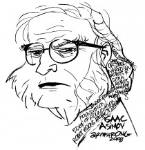
Approximately two weeks ago, Arthur Obermayer, a friend of Isaac Asimov, published an essay by Asimov entitled On Creativity. The essay, as described by Obermayer, was in response to an invitation Asimov had received to participate in a government think-tank concerning nuclear weapons.

Isaac Asimov, besides being a prolific writer, had a PhD in biochemistry, was a professor at Boston University, a member of Mensa, and was widely considered one of the intellectuals of his time. As the author of hundreds of books, mostly science fiction, he came to realized early on that the secrecy of the think-tank might interfere with his ability to express himself freely. Consequently, he left the group, contributing this essay on creativity upon his departure. It is brief, and I recommend that you read it in its entirety in order to appreciate his take on creativity.

As a brief summary, he posits that the process of creativity is the same, regardless of the discipline, art or science, and that it is, indeed, an elusive, ethereal entity even to those “self-assured eccentrics” who create.

“To be a crackpot is not, however, enough in itself,” he went on to add.

Azimov’s thought is that creativity requires isolation, but that it can be enhanced by select groups of no more than five individuals, specialist in their own fields, coming together in casual, jovial, non-combative atmospheres such as around a dining room table, or in a restaurant. He does not mention the use of wine, but from my experiences, a bottle (or two) of a good Chardonnay or Cabernet can help to loosen tongues and inhibitions. In vino veritas.

He did feel that a leader was necessary to guide the group, but that the leader must be, of necessity, non-threatening, and that he/she should guide the group discussions using “shrewd questionings.”

As a writer, I found the essay fascinating. We writers are, by nature, creative individuals with varying degrees of talent. I agree with Asimov, in that I, too, demand isolation when I write, an isolation that is not understood even by those I love, who look at me quizzically, shaking their heads as they (finally) depart to allow me to work.

However, when not actually engaged in the process of banging on a keyboard, I do cherish the company of other artists – not necessarily just writers. Artists, from animators and architects, to painters and poets, from musicians and magicians to woodworkers and writers, all seem driven by the same demanding muscular muses.

My experience with  Asimov-like group-gathering goes something like this. The conversations among the artists usually start slowly and hesitantly, until someone makes a statement that grabs the attention of the group. At that point, the pace of the conversation picks up, until, soon, polite as intentions might be, interruptions become inevitable. Cross-talk is heard by everyone in the group, even as they are engaged in discussions of their own, but, inevitably, the bantering of the entire group solidifies around a single topic. Everyone is listening intently to everyone else’s ideas.

Then there comes silence, each participant lost in the depths of his/her own mind, crunching the ideas of the others, bouncing them against their own. Usually, everyone’s chin winds up on their chest, eyes mere slits, the creative juices overflowing.

The briefest of polite goodbyes barely register, and then, alone once again, the fingers cannot fly across the keys fast enough to keep up with the roaring avalanche of thoughts, trying to organize Pollock- paint-drops into patterns, scattered, loose, hither and yon, breathing as rapidly as the mind, flashing fingers too slow to keep up, until, until…exhaustion.

A rise from the chair, a deep breath, meandering into the kitchen to make a cup of coffee, unaware of familiar surroundings, sparks of thoughts still shooting off in all directions, hurrying back to the keys, sips of hot coffee scalding the lips because the new ideas will not be denied.

But…words come slower now, thankfully – but not so thankfully, because the rush was so delightfully intense. The words become more deliberate, still genuine, but not as scattered, as the pace continues to slow, until you sit back for another sip of that coffee – now cold.

Finally, fully under control, you sit back down to read what you have written, amazed at the prose, its sheer poetry, laughing at some convoluted, incoherent contrivances. You lean back, smile contentedly, and go to bed.

But sleep does not end the madness. Over the soundest of snores, the mind untwists those convoluted contrivances into smooth, ironed sentences with just a touch of the starch of common sense where needed.

First thing in the morning, you fix what the mind discovered while asleep, and, thus, the first of way-too-many rewrites begins. You are, after all, a writer.

Einstein said, “The intellect has little to do on the road to discovery. There comes a leap in consciousness, call it intuition or what you will, and the solution just comes to you and you know not how or from where.”

Your thoughts?FotoFlexer_Photo Quill

Piracy is never romantic, Jack Sparrow be damned

Not so Jolly Roger

Not so Jolly Roger

Piracy, banditry, or any other self-serving tag line you want to apply to thieves in the act of burglarizing intellectual property (IP) is never romantic, or audacious, or heroic, Jack Sparrow with his bandanna, earrings and self-effacing grin be damned.

Recently, Julie Andresen started a discussion on Google+ entitled “What are your thoughts on content piracy?” She got over thirty comments with opinions varying from “piracy is great,” to one advocating a personally administered penalty of “trans-anal evisceration.” Most of the heat came from a handful of the respondents, who purported to be listening but obviously were not hearing one another.

Ms. Andresen started her discussion by including a reasoned post, entitled The Question of Piracy by David Amerland in which Google stresses the major, and oft repeated, argument for piracy, namely, “Piracy often arises when consumer demand goes unmet by legitimate supply,” which, of course, is really no argument at all. It attempts to justify lawlessness by blaming inefficiency. With this reasoning, any time your mail is late you could go down to the Post Office to raid their coffers.

Here are some of the (slightly paraphrased, intent intact) arguments  in favor of piracy from that post. No names have been attributed to prevent author embarrassment:

  • Piracy is great. People who don’t want to pay for a book get to read it regardless and the author gets their work read and maybe some exposure. It’s a win-win. If that wasn’t the case, they’d have never read it, anyway, so…
  • It does not cost the creator much and provides him/her with exposure. Plus the more the public gets to know an author because of exposure to his/her work, the more personal the connection to that person becomes and the less likely they are to pirate his/her work.
  • While piracy may be against the law, there is insufficient data to prove it damages anyone.
  • Buying second hand anything  (like books or DVDs, etc.) is basically the same as piracy. None of that money goes to the creator or developer/publisher when you buy pre-owned.
  • Those who are against piracy, regardless of their reasoning, need to understand that their objections are practically irrelevant. They are not going to stop people from copying music, movies, books, or whatever. The market has changed, they must adjust.
  • Piracy is necessary. The copyright laws have been subverted by the media conglomerates in order to tie it up so that future generations won’t have access to it.
  • The industry is doing it to itself by charging too much.
  • You are presuming that you have the right to the buyer’s money. You don’t. Copying your work doesn’t actually deprive you of anything that you’re actually entitled to. If someone steals your car, you don’t have a car. If someone copies the bits and bytes of your story, you still have your story
  • Have you ever repeated a joke that you heard somewhere? What about the poor comedian you ripped off?
  • The default assumption against piracy is that every item downloaded is a retail loss. That’s nonsense. In the real world, people have limited budgets, and their entertainment budgets are realistically going to be smallest portion of their overall budget. Therefore, just because someone downloaded your book or movie or song doesn’t mean that they were going to give you money for it
  • I’d rather deal with pirates than the corporate looters of the publishing industry
  • There have been plagiarism laws on the books for decades and infringement laws as well. Enforcement has always been the problem and with global markets just a click away, the issues become more intractable. When the cost of defense is more than the loss, the only victories are Pyrrhic
  • Intellectual monopoly protections almost always hinge on Marxist notions of the labor theory of value. “I worked hard on this, so I must receive the benefit from it!”
  • I hope, for the sake of intellectual consistency if nothing else, you don’t use any elements from the public domain or the common cultural history of mankind. Since you evidently think that so-called intellectual property is identical to real, physical property, I can’t see how you can abide a time and statute-limited-definition of that property right.
  • The people who would pirate your material wouldn’t have bought your book anyway.

Notice that there is no real logic here. One excuse is offered after another, including some upside down interpretation of Marxism.

The main argument of this warped mentality is that if I want it, but it is unavailable for whatever reason, I will take it. This is akin to the argument that someone wearing a gold chain on a NYC subway deserves to be robbed, or that if a woman dresses provocatively and I desire her, I can rape her.

Their secondary argument is that piracy always has been and always will be, so I might as well participate.

And there is no shame.

Now, here are some of the arguments against piracy:

  • It robs the creator of his just dues
  • My concern isn’t piracy by an individual who wants to read, watch, or listen.  My concern are those who pirate with the intent to make money for themselves and/or their business concern from the pirated works
  • Piracy sucks, and people who do it should let me take money out of their pockets. It’s exactly the same thing
  • People pirate because they can get away with it. It has nothing to do with how much or how little something costs, or whether or not they “like” it
  • If I can’t get paid for what I do, why bother doing it? I have to eat, too. I have to pay bills. It takes months of hard work to create a book that must then be edited and proofed and formatted and a nice cover slapped on it. This stuff isn’t free. It’s asinine to say pirating is okay. Pirates steal from creative people. They’re taking the bread out of our mouths
  • Take enough of our work without compensation and pretty soon there will be nothing to steal
  • No one has the right to suggest that the IP creator should just bite the bullet and let his/her work go for free. We do NOT live in either a communist nor a socialist nor a fascist world…at least not yet.  IP anarchists be damned.
  • Copyright infringement is theft by any other name.
  • I am the creator.  My work is mine to monopolize.
  • At least pirates, thieves and scam artists are honest in their intent: “We will make as much from you and/or your stuff as we can get away with stealing.  IP abolitionists are off the cliff all the way around – beyond all rational mind,

I am not neutral. I believe in the ownership of intellectual property. I know how much work it takes to produce a product. If time is money, than all the time an artist takes to produce a work of art puts a value on that work. The popularity of the work determines how much people are willing to pay for it.

In no case is it free.FotoFlexer_Photo Quill

To copyright or not to copyright, that is the question

To be or not to be That is the question

To be or not to be
That is the question

To copyright or not to copyright, that is the question, but it should not be a question. To copyright is the only answer.

My post, Book Titles, Fonts and Copyright Changes, created a heady discussion about copyright problems, international and domestic, to a degree I had not anticipated, one that requires a continuing dialogue.

The Berne Convention of 1886 set forth basic international law regarding copyright, recognizing the copyrights of works of authors of all nations, in the same way that it recognizes the copyrights of its own citizens. It also required automatic, strong minimum standards while prohibiting mandatory registration. This means that your work is protected from the moment it is committed to some form of visual or audio copy.

The laws for copyrighting vary from country to country. In America, registration is made through the US Copyright Office. In Canada, you can register your work at the Canadian Intellectual Property Office. In the UK and AU, copyright is considered an “automatic right.” In New Zeeland, no registration is required, or even possible, other than that provided by the Berne Convention. Generally speaking, those governments that require/provide copyright services, charge fees of varying amounts depending on the service offered.

The date of copyright becomes important when there are conflicting claims of ownership. Once registered, as in places like the U.S. and Canada, the date becomes fixed. In places like UK, AU, and NZ a date can be established by sending a copy of the work to the applicable national library.

It is also a good idea to affix the copyright symbol ©, the year, your name and boilerplate copy such as, “ Except as provided by the Copyright Act no part of this publication may be reproduced, stored in a retrieval system or transmitted in and for or by any means without the prior written permission of the publisher.” The wording varies, so use whatever satisfies your paranoia.

There are also differences about what excerpts are allowed between “fair use” (US), e.g. commentary, research, criticism, parody, news, teaching, archiving and scholarship and “fair dealing” (UK), e.g. research, review, criticism, news, and parody. Generally, U.S. policies are a bit more stringent. Also, in the US, in the case of lawsuits, only registered works can collect damages and attorney’s fees.

The length of copyright also varies by country. In the US, a copyright is good for 70 after the author’s death. In the UK, it is good for 50 years after death.

The Myth of the Poor Man’s Copyright

For a more complete examination of the Poor Man’s Copyright click on the link above. It is a terrific, straightforward discussion of this subject, generously provided by Jonathan Bailey on his blog, Plagiarism Today.

In short, the Poor Man’s Copyright is the idea that you can write a book, compose a song, draw a picture, etc, seal it in an envelope, and send it to yourself with the assumption that the date on the envelope will prove that its contents were mailed on such and such a date, thereby protecting the author.

No such luck- for several reasons:

  • There is no proof as to who created the work inside.
  • Envelopes can be steamed open.
  • You cannot sue in federal courts. Since the work in question was never registered nationally, any lawsuit becomes a local issue, subject to only local damages.

Read Mr. Bailey’s article for even more convincing arguments.

P.S. Do not be deceived by faux-government agencies offering to do the copyright-work for you. It is simple enough to do yourself. Trust me. I did it and so can you.

Danger still lurks!

OK, you’ve done the right thing and copyrighted your book with the US Copyright Office. Now, you are protected.

So I thought, too, until I read Vivian Greene’s comments on the post mentioned above.

First off, some nations that are signatories of the Berne Convention do not always honor their commitment. China is notorious for the theft of proprietary secrets.

Ms. Greene has had her work published in five countries, using her photo, for which she has received not a penny.

But it is not just in other countries. Here in the good, ole USA, companies have used Ms. Greene’s quotes on merchandise in stores as famous as Target, Wal-Mart, Nordstrom’s, and Whole Foods.

Here is her YouTube video:  http://www.youtube.com/watch?v=UG-pZ-wzXxU. If this doesn’t scare any hesitancy out of you, nothing will.

But even copyrights cannot protect us completely.

Need we be reminded of Napster? There are those “out there” who believe that books and music should be free. They pass along the work of others because they enjoy what they read or hear, and “feel” that others should enjoy it too – without having to pay for it, of course. They give it away for free!

Why is there so little respect for the WORK of those of us who toil to create?

Protect yourself as best you can. Copyright your work!FotoFlexer_Photo Quill